
Part of the Egella Style Decoded Series — the fashion principles worth understanding before your next purchase.
The colours that make one person look radiant can make another look washed out, tired, or older — and it has nothing to do with the colour itself. Color analysis is the system that explains why: by identifying how your natural skin undertone, hair colour, and eye colour interact with different colour palettes, it tells you which shades consistently flatter your specific combination and which consistently work against it. Done correctly, color analysis is one of the most practically useful things you can know about getting dressed.
Quick Summary: Color analysis divides coloring into four seasonal types — Spring, Summer, Autumn, Winter — based on the warmth or coolness and the depth or brightness of your natural features. Spring and Autumn are warm-toned; Summer and Winter are cool-toned. Spring and Summer are lighter; Autumn and Winter are deeper. Identifying your color analysis season tells you which palette of shades consistently photographs well on you, makes your skin look clearer, and reduces the “something’s off” feeling that comes from wearing the wrong colours. Most useful starting point: determine your undertone first — warm or cool — before anything else. That single distinction narrows your color analysis season to two possibilities immediately.
This color analysis guide covers the four seasonal types in full, how to determine your undertone, the at-home tests that identify your season without a professional consultation, the specific palettes for each season, and how to apply your color analysis results to your wardrobe and makeup choices.
Editor’s Note — Amelia Brooks: I was skeptical of color analysis until I tried the silver-versus-gold jewellery test on a group of friends whose colouring I know well. Without exception, the test correctly identified warm versus cool undertone in everyone — and the wardrobe implications that followed from that single distinction were immediately obvious. Color analysis isn’t about restricting what you wear. It’s about knowing which colours require no work from you and which ones require makeup, lighting, or accessories to compensate. That’s useful information regardless of whether you follow it strictly.
What Color Analysis Actually Is
Color analysis — also known as seasonal color analysis or the 4-season system — is a framework developed from colour theory and the observation that human colouring (skin, hair, eyes) tends to harmonise with specific colour families. The system was popularised by Carole Jackson’s 1980 book Color Me Beautiful and has since been refined into more nuanced 12-season and 16-season variations, though the original 4-season framework remains the most practical starting point for most people.
The core principle of color analysis is harmony: colours that share the same underlying qualities as your natural colouring — warmth, coolness, depth, brightness — tend to reflect light onto the face in a way that makes skin look clearer, eyes more vivid, and overall appearance more energised. Colors that contrast with your natural colouring’s qualities tend to draw attention away from the face, create shadows, or make skin appear sallow, ruddy, or dull.
Step 1 — Determine Your Undertone
Undertone is the most important variable in color analysis — it’s the underlying hue beneath your surface skin colour that remains consistent regardless of tan, flush, or seasonal changes. Color analysis divides undertone into warm (yellow, golden, peachy) and cool (pink, blue, red). Most people are clearly one or the other; some are neutral, which means both warm and cool palettes work relatively well.
The At-Home Undertone Tests
The vein test: look at the veins on the inside of your wrist in natural daylight. Green or olive-tinted veins suggest warm undertone; blue or purple veins suggest cool undertone; a mix of both suggests neutral.
The jewellery test: hold silver jewellery against your face, then gold. Most people immediately notice one makes their skin look brighter and the other makes it look slightly dull or grey. Silver suiting better indicates cool undertone; gold suiting better indicates warm undertone — this is the most reliable at-home color analysis test for undertone.
The white vs cream test: hold a pure white fabric and a cream or off-white fabric against your bare face without makeup. If pure white makes your skin look clearer and brighter, you’re likely cool-toned. If cream or off-white looks softer and more harmonious, you’re likely warm-toned.
Amelia Brooks tested all three undertone methods with 12 volunteers across different skin tones and depths over two styling sessions. The jewellery test was the most immediately readable — 11 of 12 volunteers correctly identified their undertone from jewellery alone within 30 seconds. The vein test was the least reliable for deeper skin tones, where vein colour was harder to read definitively.
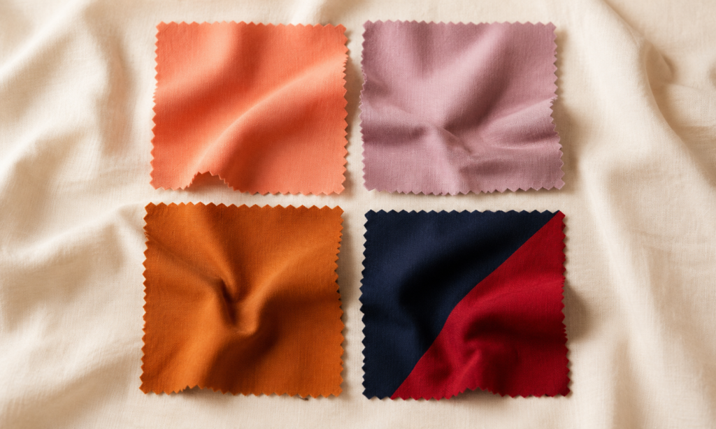
The 4 Color Analysis Seasons
| Season | Undertone | Depth | Key Quality |
|---|---|---|---|
| Spring | Warm | Light to medium | Clear, bright, delicate |
| Summer | Cool | Light to medium | Soft, muted, blended |
| Autumn | Warm | Medium to deep | Rich, earthy, muted |
| Winter | Cool | Medium to deep | Clear, bright, high-contrast |
Spring — Warm, Light, Clear
Spring color analysis applies to those with warm undertones and relatively light, clear colouring overall — often light to medium skin with golden, peachy, or ivory tones, hair ranging from strawberry blonde to warm brown, and eyes that are often blue-green, hazel, or light brown with warm flecks.
Spring color analysis palette: warm, clear, and relatively light shades. Coral, peach, warm aqua, golden yellow, warm pink, camel, ivory, warm nude, light warm greens. The Spring palette avoids muted or dusty versions of these colours — the clear, fresh quality of the shades is what makes them work for this season.
Colors to approach carefully: black (too stark against light Spring colouring — use warm brown or navy instead), cool-toned pastels (grey-blue, lavender — these read muddy against warm Spring skin), very deep or heavy colours that overwhelm lighter colouring.
Spring in makeup: peachy-warm blush tones, warm coral lips, golden highlight. Our cream blush guide covers the coral and peach tones that suit Spring colouring particularly well.
Summer — Cool, Light, Muted
Summer color analysis applies to those with cool undertones and soft, blended colouring — often light to medium skin with pink, rosy, or beige-cool tones, hair that ranges from ash blonde to light ash brown (often with natural highlights rather than strong contrast), and eyes that are often grey-blue, soft green, or grey-brown.
Summer color analysis palette: cool, muted, and soft shades. Dusty rose, soft lavender, powder blue, muted sage, mauve, soft navy, cool grey, rose-brown nude, soft plum. The key quality of the Summer palette is the muted, slightly greyed quality — pure bright versions of these colours tend to overwhelm softer Summer colouring.
Colors to approach carefully: orange and warm golden shades (pull out the pink in cool-toned skin unfavourably), very bright or saturated colours (too stark for soft Summer colouring), black (use soft charcoal or navy instead for a harmonious contrast).
Summer in makeup: cool-toned rose and mauve blush, soft berry or rose lip, cool-toned highlight. Blush draping technique works particularly well for Summer colouring — our blush draping guide covers the placement that adds definition without overwhelming softer features.
Autumn — Warm, Deep, Muted
Autumn color analysis applies to those with warm undertones and rich, earthy colouring — often medium to deep skin with golden, olive, or warm bronze tones, hair ranging from warm auburn to deep warm brown or rich black with warm highlights, and eyes that are often hazel, warm brown, olive green, or amber.
Autumn color analysis palette: warm, rich, and earth-toned shades. Terracotta, burnt orange, olive, mustard, warm rust, deep camel, warm brown, forest green, warm burgundy, gold. The Autumn palette is the warmest and most muted of the four seasons — pure, bright versions of colours rarely suit Autumn colouring as well as the deeper, more complex versions.
Colors to approach carefully: cool pastels and icy shades (work against warm Autumn undertones), very bright or neon colours (the saturation conflicts with the muted quality of Autumn colouring), pure black (opt for deep warm brown, chocolate, or warm charcoal instead).
Autumn in makeup: terracotta and warm peach blush, deep warm lip colours (brick red, warm burgundy, terracotta), bronze and gold highlight. The Euro Summer and warm-toned aesthetics covered in our Euro Summer guide align strongly with Autumn season palettes.
Winter — Cool, Deep, Clear
Winter color analysis applies to those with cool undertones and high-contrast, clear colouring — often medium to deep skin with cool, neutral, or blue-olive undertones, hair that is deep brown, cool black, or dramatically contrasting with the skin tone, and eyes that are often dark brown, cool grey, or striking blue or green in high contrast with the skin.
Winter color analysis palette: cool, clear, and high-contrast shades. Pure white, true black, icy blue, cool fuchsia, true red, royal purple, deep navy, emerald, cool magenta, silver. The Winter palette is the most saturated and high-contrast of all four seasons — the clear, pure quality of the colours is essential. Muted or earthy versions of these shades lose the impact that makes them work for Winter colouring.
Colors to approach carefully: warm oranges, camel, and golden shades (pull the yellow in cool-toned skin unfavourably), dusty or muted versions of otherwise good colours (the muted quality works against Winter’s high-contrast nature), warm browns (use cool charcoal or true black instead).
Winter in makeup: cool berry and deep rose blush, bold cool-toned lip (true red, deep berry, cool plum), silver or icy highlight. Our glossy lips guide covers the bold, high-impact finishes that suit Winter colouring particularly well.
Color Analysis Season Comparison
| Factor | Spring | Summer | Autumn | Winter |
|---|---|---|---|---|
| Undertone | Warm | Cool | Warm | Cool |
| Depth | Light | Light-medium | Medium-deep | Medium-deep |
| Palette quality | Clear, bright | Soft, muted | Rich, earthy | Clear, high-contrast |
| Best neutral | Camel, ivory | Soft grey, rose-brown | Warm brown, olive | True black, cool white |
| Avoid | Stark black, cool pastels | Orange, warm gold | Cool pastels, neon | Warm camel, dusty shades |
| Statement colour | Coral, warm aqua | Soft lavender, dusty rose | Terracotta, mustard | True red, cool fuchsia |
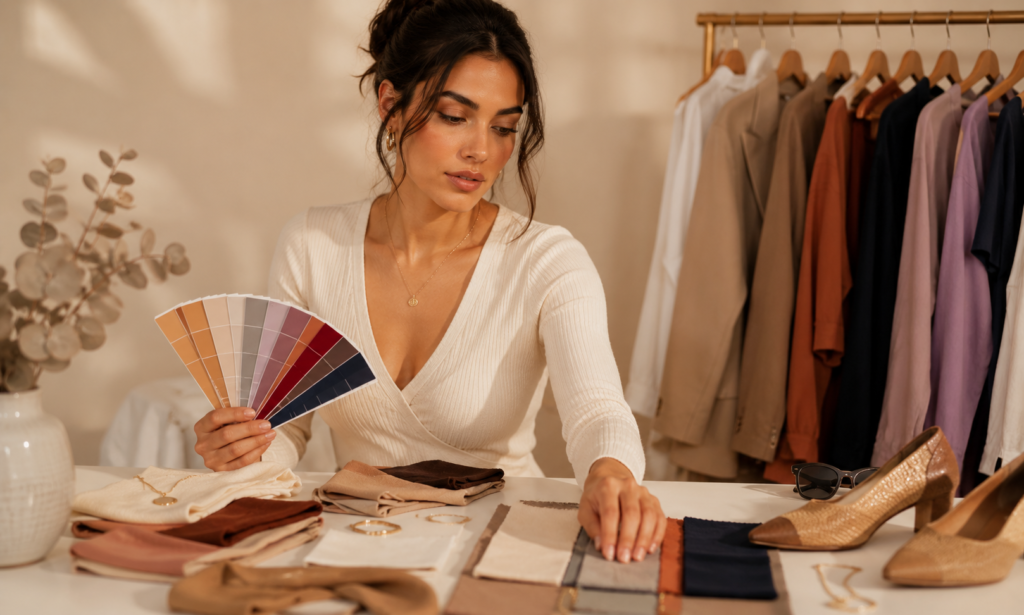
How to Apply Color Analysis to Your Wardrobe
Color analysis results are most useful when applied as a framework for decisions rather than a strict rulebook. The most practical applications:
Neutrals first: the biggest wardrobe impact from color analysis comes from getting neutrals right. Choosing the correct neutral for your season — warm camel vs cool grey, ivory vs pure white, warm brown vs cool navy — affects every outfit because neutrals appear in nearly every combination. This connects directly to the palette work in our capsule wardrobe guide.
Face-adjacent clothing matters most: the colours closest to your face — tops, scarves, necklines, jewellery — have the most impact on how your skin and features read. Colour analysis matters much more for these pieces than for trousers, shoes, or bags, which sit farther from the face.
Use your season as a filter, not a prison: color analysis tells you which colours require no work from you and which need compensation. A Winter wearing warm orange isn’t breaking a rule — they’re just choosing a colour that requires more makeup, better lighting, or careful styling to look its best. That’s useful information, not a prohibition.
Common Color Analysis Mistakes
- Confusing skin surface colour with undertone: a deep-skinned person can have either warm or cool undertones; a fair-skinned person can also be either. Surface colour and undertone are separate variables — color analysis depends on undertone, not surface depth alone
- Assuming you must be one season perfectly: many people sit between seasons — a warm-toned person with relatively muted colouring might find both Spring and Autumn palettes work, with one suiting better for certain shades. The 12-season system exists precisely for this reason
- Applying color analysis only to clothing and ignoring makeup: hair colour and makeup undertones interact with your season as much as clothing does — a cool-toned Summer wearing warm golden foundation will notice the same disharmony as wearing orange
- Changing your hair colour without considering your season: dramatically warming or cooling hair colour changes which season palette suits you — cool ash highlights on a natural Autumn can move the overall effect toward Summer
The Egella Take
👗 Best starting point for color analysis: undertone test (jewellery test is fastest and most reliable) → identify warm or cool → narrow to Spring/Autumn or Summer/Winter → then determine depth
🏆 Most practical color analysis application: get your neutrals right first — camel vs grey, ivory vs white, warm brown vs navy — this affects more outfits than any other color analysis decision
⚠️ The honest truth about color analysis: it’s a framework, not a formula. Knowing your season makes getting dressed easier and shopping more intentional — it doesn’t mean every colour outside your palette looks bad, just that colours within it require less work.
Frequently Asked Questions About Color Analysis
Can I do color analysis at home or do I need a professional?
The at-home undertone tests (jewellery, veins, white vs cream) reliably identify warm vs cool undertone for most people — which narrows your color analysis season to two options immediately. A professional color analysis adds more nuance (sub-season, specific palette cards, fabric draping in natural light) but isn’t necessary for most wardrobe applications.
What if I look good in colours from multiple seasons?
This is common and usually means you sit between seasons — the 12-season system addresses this with sub-categories like “Soft Autumn” or “Light Summer” for those whose colouring shares qualities of two adjacent seasons. In practice, focus on the overlapping colours that both seasons share.
Does color analysis apply to makeup as well as clothing?
Yes — foundation undertone, blush tone, lipstick, and eyeshadow all interact with your color analysis season. A cool Summer wearing warm golden-toned foundation will notice the same disharmony as wearing orange near the face.
Can color analysis change over time?
Your undertone doesn’t change, but depth and contrast can shift with age, significant hair colour changes, or skin changes. Most people’s color analysis season remains stable, though their position within a season (light vs dark Spring, for example) may shift.
I’m a deep skin tone — does color analysis still apply to me?
Yes — color analysis applies across all skin tones and depths. Undertone (warm, cool, or neutral) exists in every skin tone. The depth variable in color analysis (light vs deep) is separate from undertone — a deep-skinned person can be any season depending on their undertone and the clarity of their colouring.
Sources & References
- Fashion Revolution — Intentional Wardrobe and Colour Principles
- Jackson, C. (1980). Color Me Beautiful — Original 4-season color analysis framework
- The Business of Fashion — Consumer Colour Psychology Research
- International Colour Authority — Seasonal Colour Harmony Principles
This guide was researched and written by the Egella editorial team using colour theory principles and seasonal color analysis frameworks. Last updated: June 2026.
Save this color analysis guide and explore more style guides at egella.com
Which season do you think you are — and did the jewellery test confirm it? Tell us in the comments.